About the project
The AEGLE project aims to generate value from healthcare data with the vision to improve translational medicine and facilitate personalized and integrated care services overall improving healthcare at all levels, to promote data-driven research across Europe and to serve as an enabler technology platform.
My Role
I led the user experience evaluation and redesign of the initial prototype produced in phase 1 (of 3) of the AEGLE project.
The AEGLE prototype was constructed utilising data from three specific case studies; ICU, Chronic Lymphocytic Leukemia (CLL) and Diabetes 2.
Challenges
There were several temporal, spatial and technological challenges within the project:
My initial brief was to complete a formal usability test of an initial prototype. However, given the volatility and the lack of availability of the prototype I had to think laterally to create a user experience evaluation methodology that was pragmatic and feasible.
The Process

My methodology; diagram illustrates the structure and flow of UX processes I used within the AEGLE project.
Literature Review Phase
To get up to speed with this niche domain I spent some time familiarising myself with the academic research literature that related to user experience of medical informatics, methodology, Big Data and visualisation.
Key insights
| UX of Health Information Systems (HIT) | Methodological |
| Big Data | Visualisation |
Research Phase
The AEGLE platform prototype was evaluated using a hybrid usability inspection methodology. This methodology combined the results from heuristic analysis and an adapted cognitive walkthrough. Neilsen and Molich’s (1990) ten usability heuristics were used to evaluate the application. These results were consolidated and categorised by severity.
As the usability team did not have a comprehensive understanding of how different users may want to utilise the system, a typical cognitive walkthrough was thought premature. For the same reason, formal empirical usability testing was thought to be inappropriate. Instead a new approach which could illuminate and clarify the potential tasks, actions and goals as well as the potential user journeys taken by different users was required.
User involvement at this early stage would enable an understanding of different users' work practices and how the application could best support those practices. An additional complication to the usability inspection protocol was that participants were located in Greece, whereas the usability team was based at Kingston University, London. Thus, the most practical solution was a combination of the cognitive walkthrough performed by experts initially and followed by an adapted pluralistic walkthrough, where participants gave their insights remotely via a video conferencing tool.
Video conference screenshot during PUW
This novel method was named the participatory usability walkthrough (PUW). This process involved the experts offering a walkthrough of a journey through the application. Participants were asked their preferences on how they would like to best navigate through the application. Additionally, they were prompted for any changes in functionality and interactions they would require to best suit their work practices. These results were then consolidated.
Synthesis
Personas
Personas are described as "detailed descriptions of imaginary people constructed out of well-understood, highly specified data about real people" (Pruitt and Adler, 2006). Their purpose is to guide consistency in the design of interactions. Additionally, personas help to maintain a user centred focus during the design and development process.
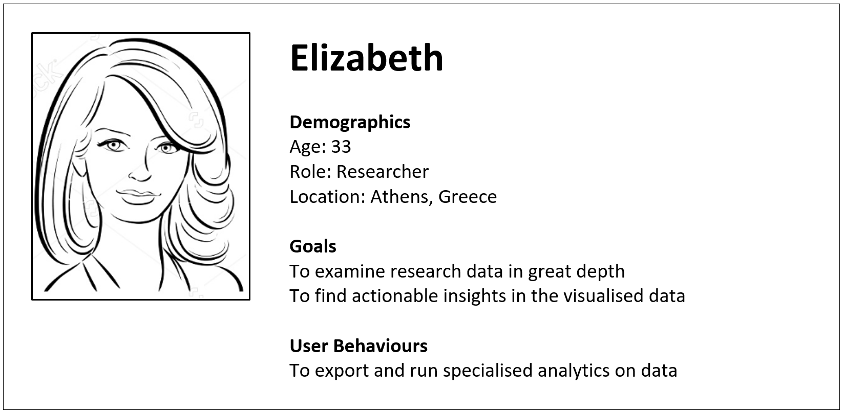
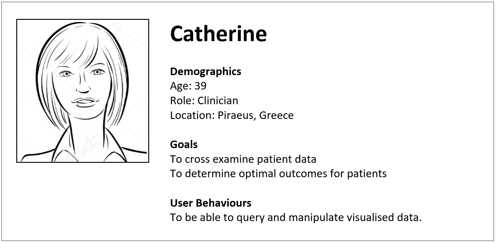
Personas
The process for persona development for the AEGLE platform was data driven from evidence gleaned from questionnaires and the participatory usability walkthroughs. The process consisted of three stages; first was to identify two typical users, then identify their goals, roles and actions and finally ascertain an understanding of their motivations towards specific tasks.
User/Workflows
New user workflows were derived from the research phase, which faciliated a better understanding of how and why different types of user would want to complete tasks. Visualisation-specific heuristics and the PUW revealed a number of key issues and design suggestions were made.
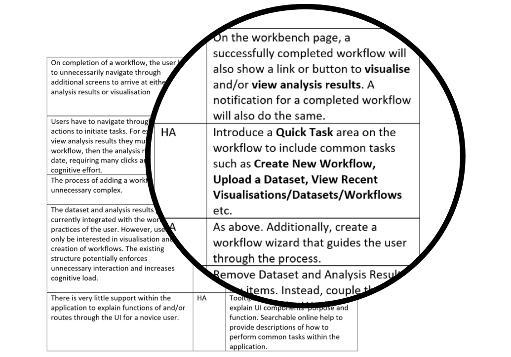
Research phase design suggestions
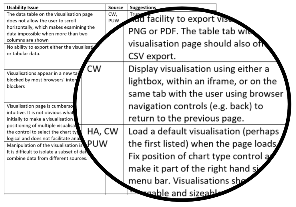
Visualisation-specific design suggestions
Users' Comments
Users also identified new functionality that they would like to be implemented.
I need to be able to analyse NGS data, run statistical analyses and create visualisations so I have to use lots of different tools. I need something that will take away the tedium of using so many different packages to complete my workflow and visualise my data.
I need to be able to export my data from AEGLE in a form I can use. I need the graphs in a form that I can put into my reports. Also, the visualisation screen has an option to show the data in a tabular form; why can't I download that?
The tools should be more specific to the different types of data and there should be specific ways of visualising them. So, for example, we might have adapted histograms to visualise immunogenetic data or survival curves.
Why can't I manipulate and interact with the visualisation directly? I should be able to click and drag on the visualisation to zoom in, or click a particular element to drill down.
Redesign
Workbench Screen
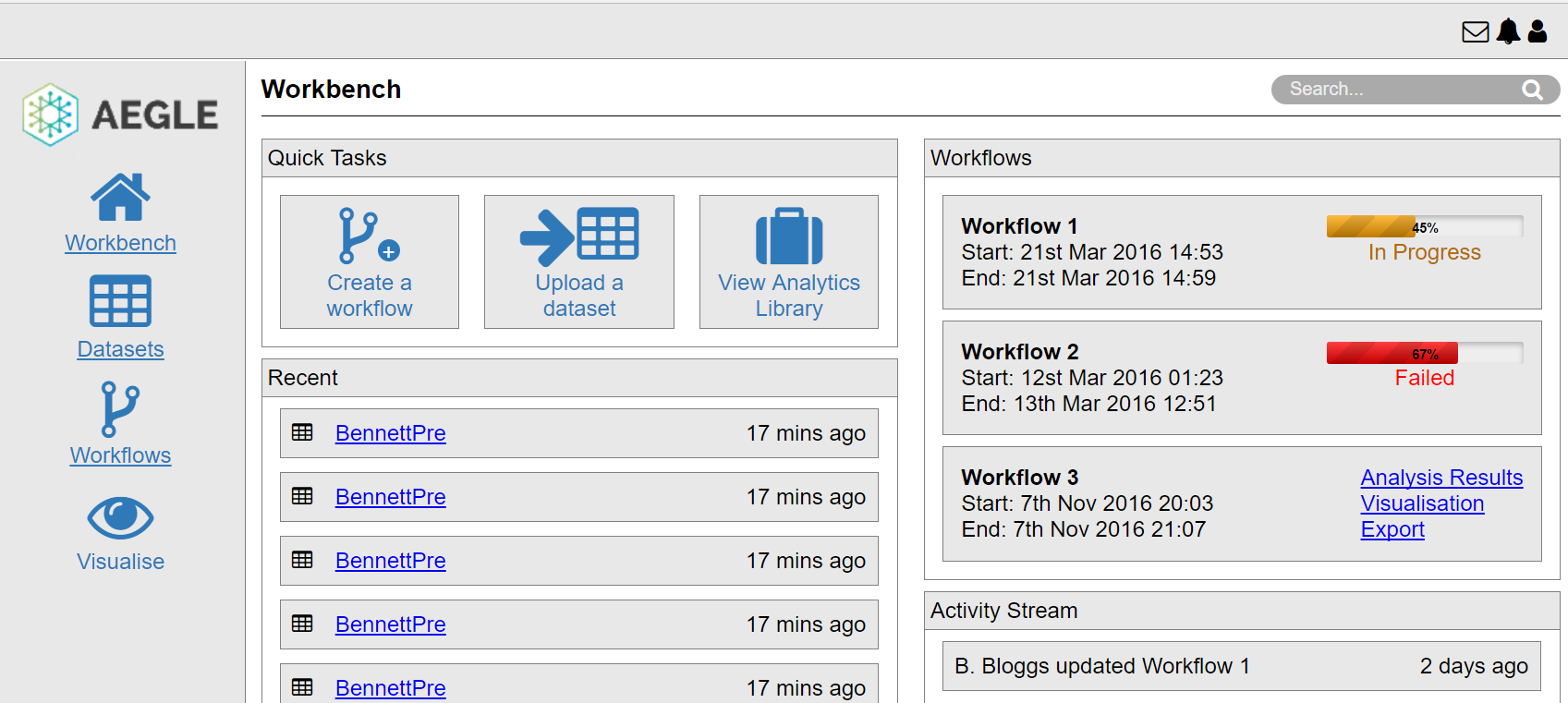
The workbench screen was redesigned to include quick tasks, recent activity and support shortcuts to visualisation and analysis results on completion of a workflow. This redesign supports the concept of reduction (Fogg, 2003) which facilitates users to efficiently complete specific tasks with the least number of steps.
A new menu area allows universal access to key functionality from wherever the user is in the application. Of particular importance is the movement of the notifications functionality from the main screen on the workbench to this universal menu, which allows a user to be notified on completion of a workflow wherever they are in the application rather than having to potentially abandon a current task. This redesign supports efficiency and effectiveness, two key metrics of usability.
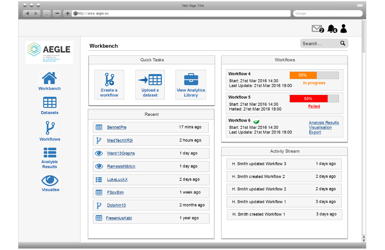
Redesigned Workbench Screen
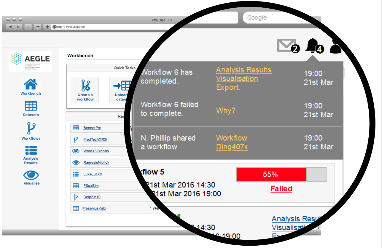
Redesigned Workbench Screen with Notifications
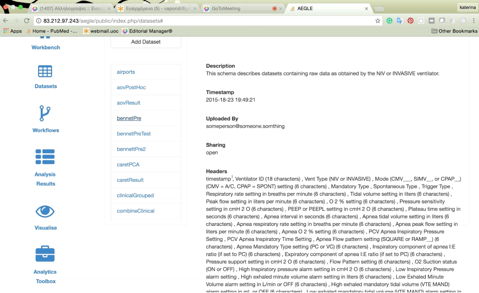
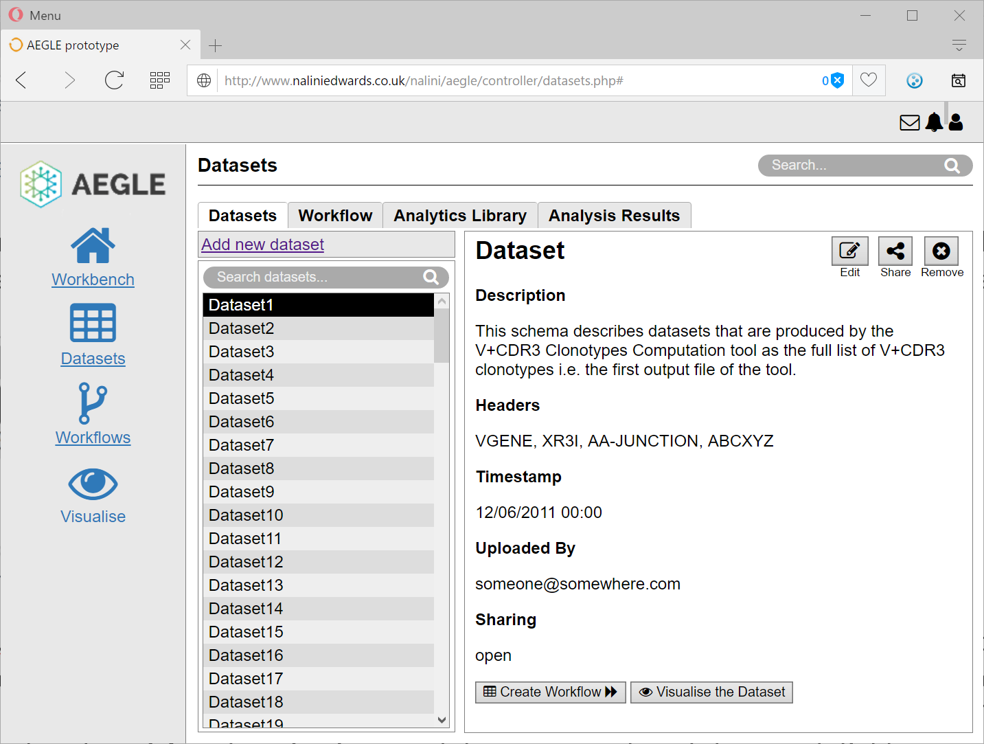
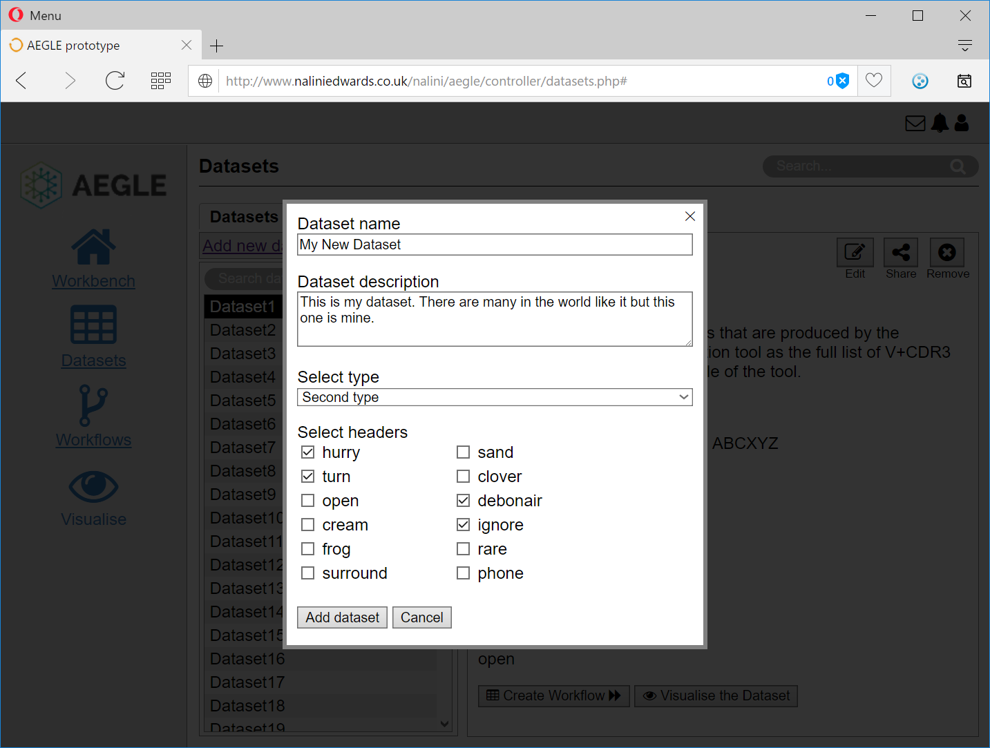
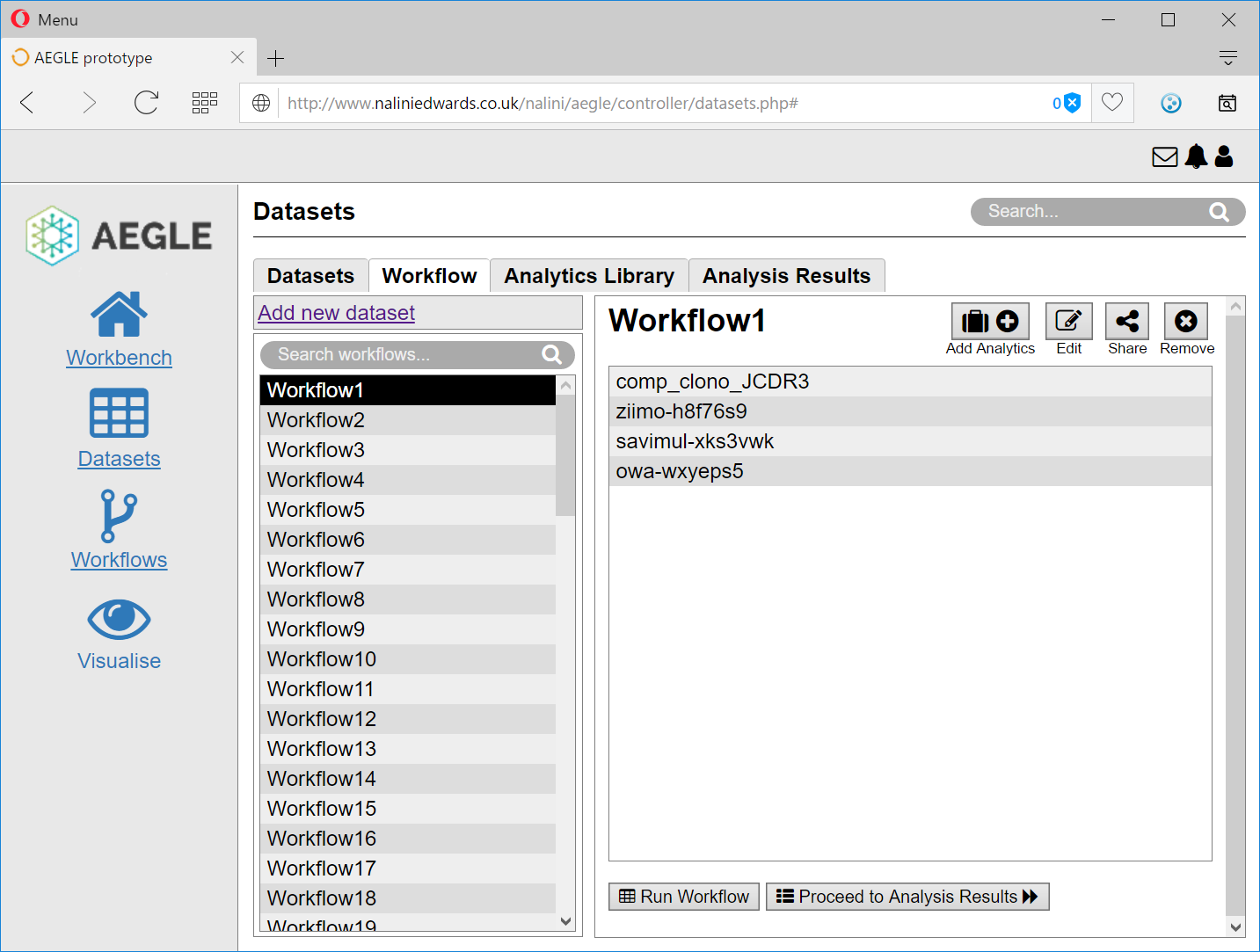
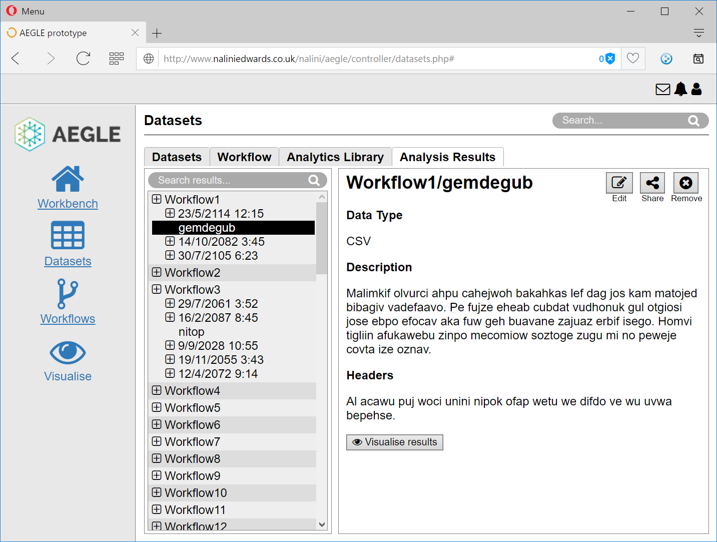
Datasets Screen
This screen highlights changes made to the text labelled buttons "edit", "share" and "remove". Iconography is used to improve consistency and build upon the notion of affordance. Affordance is an aspect of an object that makes it intuitive to how the object will be used (Norman, 2013).
Users are also given the opportunity to directly visualise a particular dataset by including a "visualise this dataset" button. This increases the efficiency of the task and supports the principle of reduction (Fogg, 2003).
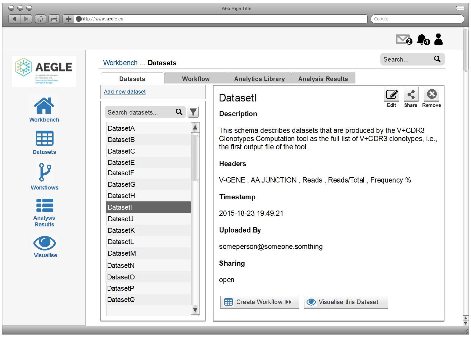
Redesigned Datasets Screen
The process of creating a workflow was particularly cumbersome and the structure enforced a number of unnecessary actions which may increase the cognitive load on users. The original flow of interaction did not potentially support the work practices of the users and their tasks within AEGLE. To resolve these issues a tab-based wizard that supported users through workflow creation and analysis was designed.
The wizard also supports a UX design pattern called sequence mapping (Tidwell, 2006). Sequence mapping labels a multi-step process and has a dual function; it shows where the user is within the process and how much is still to be done, allowing for back and forth selection with the process.
The creation of this wizard also allows the user to be supported through a complex process increasing efficiency. Fogg (2003) advocates the creation of “tunnels” for complex process, particularly for novices. Additionally, the wizard supports a user journey from beginning to end, without interfering with (expert) users who wish simply to perform a subset of the functionality available.
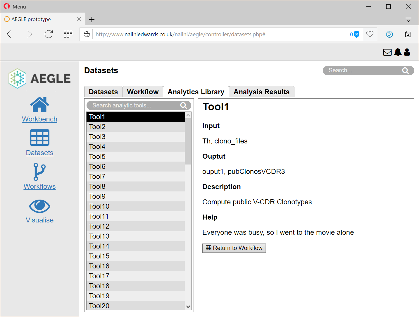
Analytics Library (Analytics Toolbox)
The original positioning and functionality of the Analytics library was difficult to discern, partly because it was labelled as a toolbox and partly because it seemed to have no integral part in the main tasks of the AEGLE platform.
The participatory usability walkthrough repositioned the importance of this functionality as a reference tool at the heart of the workflow creation (and editing) processes. As a result, the analytics library was renamed and integrated into the tabbed workflow wizard to help users decide which analytics to use.
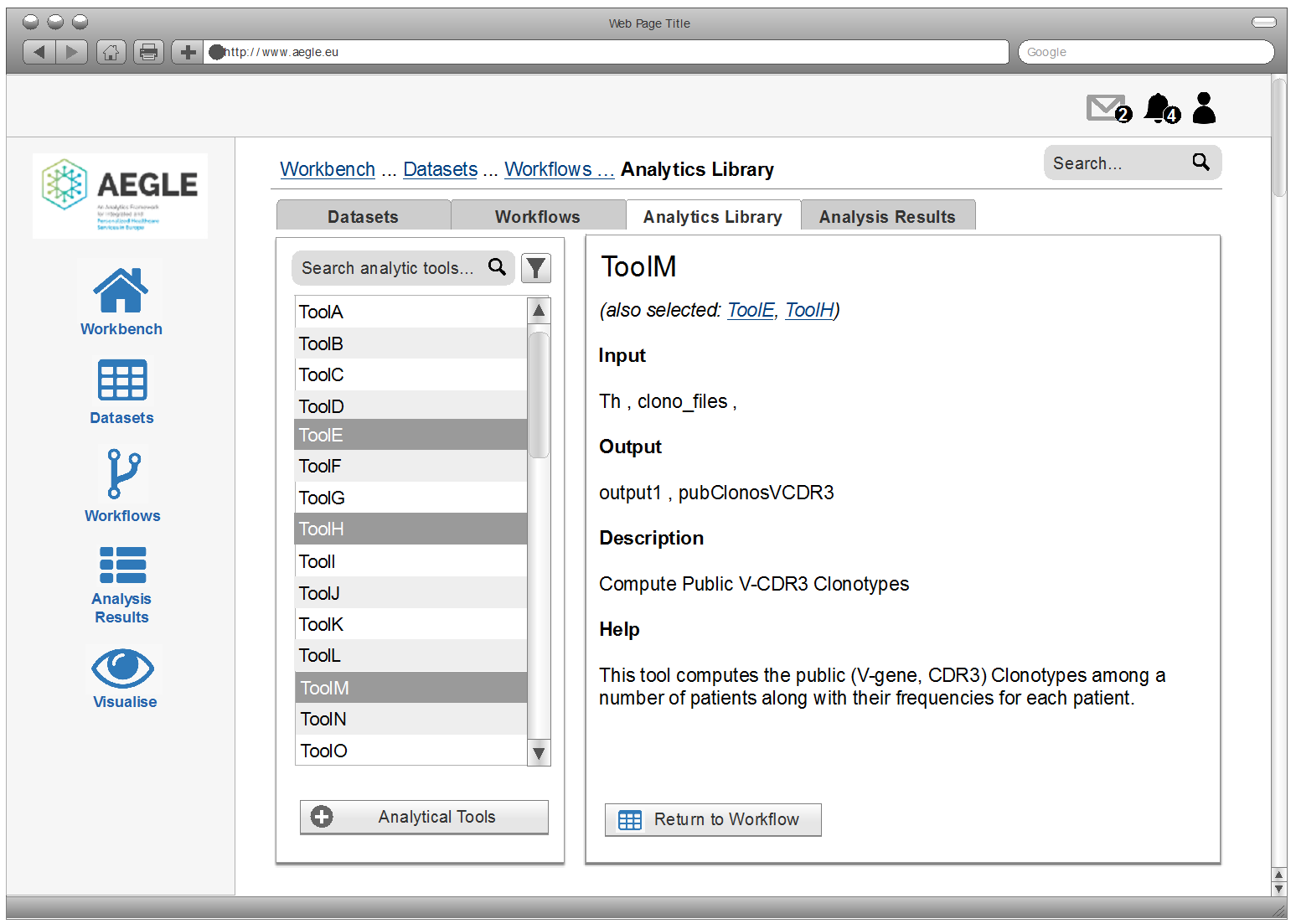
Analytics Library
Visualisation
One of the key issues noted by participants was the lack of manipulation of visualisations. Existing manipulation of the visualisation was clunky. Users found it difficult to isolate a subset of data, integrate and combine data from different sources.
The redesign allows direct manipulation of the visualisation by dragging points and other variables. It also allows navigation, manipulation and querying of the visualisation directly as well as filtering and clustering of sources.
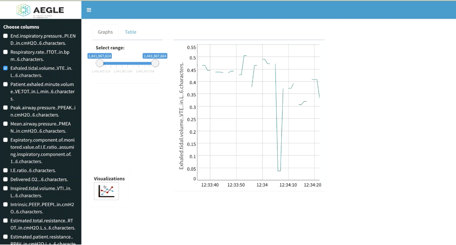
Original Visualisation Screen
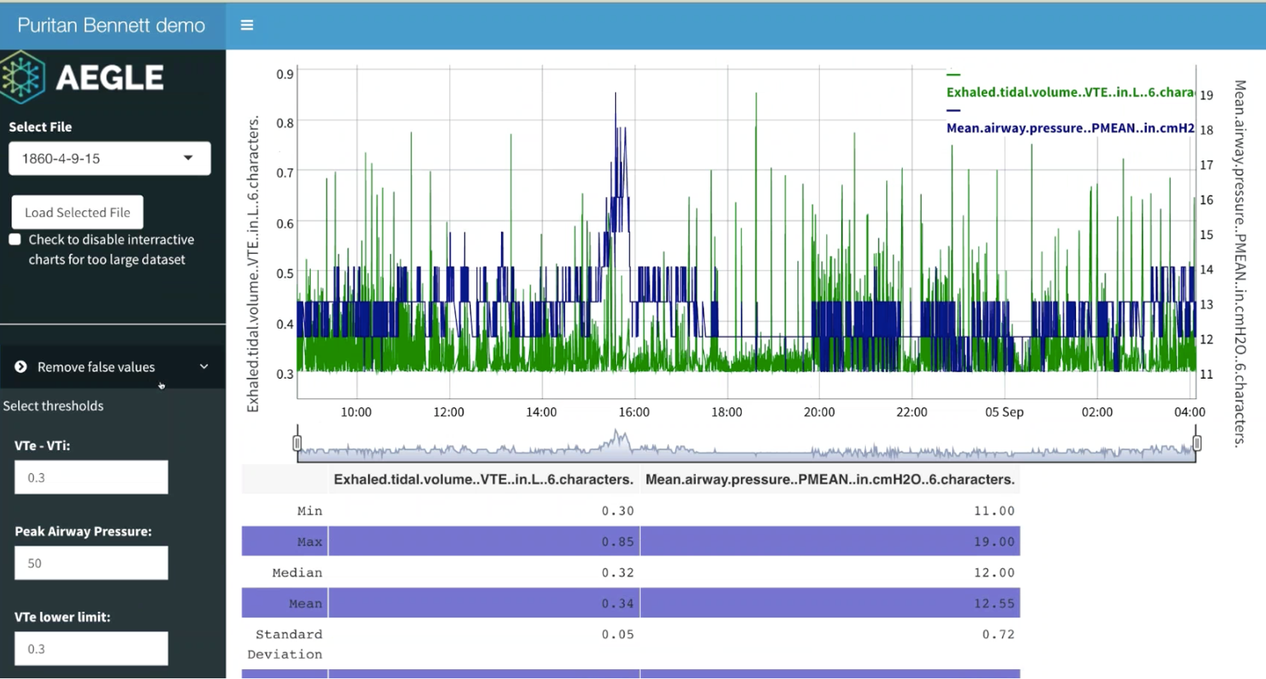
Redesigned Visualisation Screen
High Fidelity Prototype
The project management team at Kingston University felt that a high fidelity prototype would better enable them to communicate the results of the UX analysis to project partners by making it tangible. The designs were implemented in HTML, CSS, PHP, Javascript and JQuery in a way that would facilitate use of the prototype as the foundation of any future application.
Technical Design Choices
As the existing developers were familiar with the language, PHP was chosen as the base platform. However, frameworks such as Laravel and Bootstrap (used by the existing application) were avoided because of the constraints they imposed when implementing an application that conformed to the UX designs.
The prototype was inspired by the Model-View-Controller design pattern. Each screen was written as a PHP based view and paired with a vestigial controller. Sample data was created as JSON files and client-side Javascript/JSON read these files to populate the prototype screens with data. This faciliated two possible future development approaches:
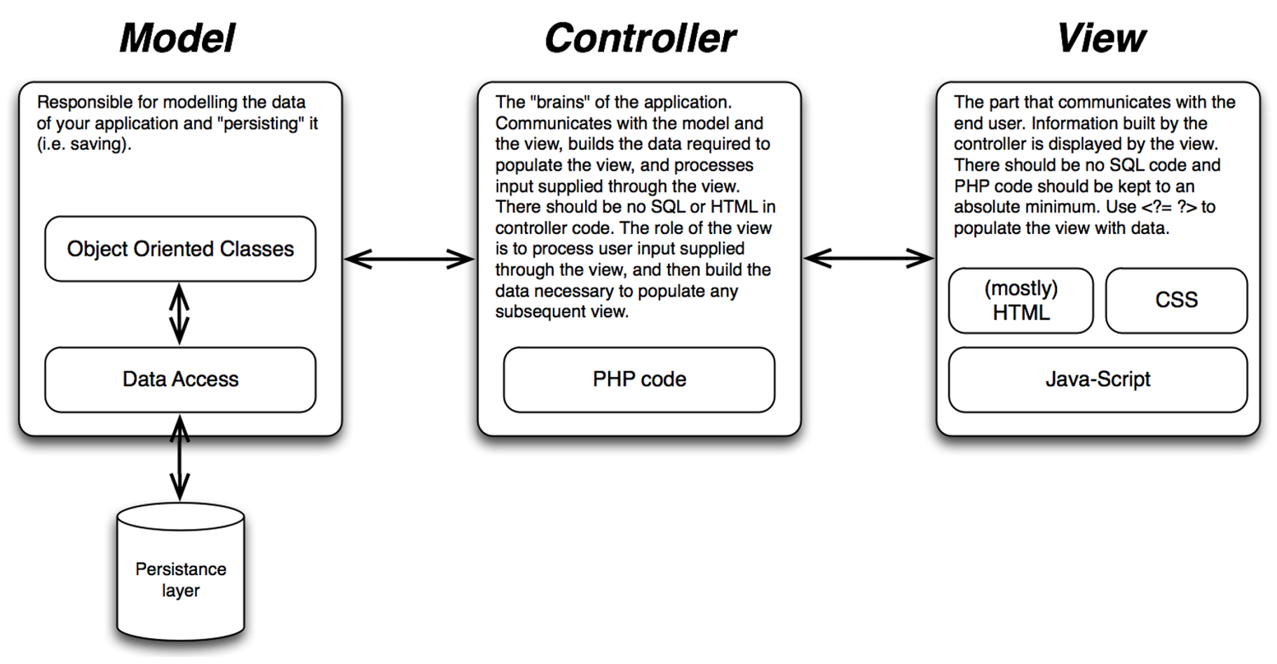
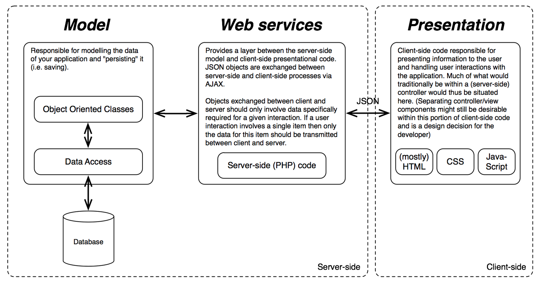
The two future development approaches
The prototype is publically available here. It includes working versions of all the screens that were redesigned during the UX processes.
High Fidelity Prototype