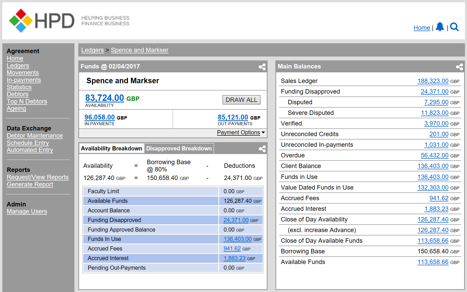
About the project
5 key hub areas identified for redesign.
HALO was a redesign development project for HPD’s Client Manager, an internet based Portal. The portal enabled HPD clients to manage their invoice financing. It allowed them to quickly release capital from receivables through invoice purchasing or lending.
Prior to redesign the version of Client Manager available to customers was approximately 12 years old.
Client Manager has 5 main hubs all of which were within scope for redesign as part of the HALO project.
My Role
My role in the HALO project was to lead user experience research across a representative client sample. The main artefact of this work was a high-fidelity web application which would serve to illustrate the functionality and interactivity to the outsourced software development team.
Challenges
There were several temporal and technological challenges within the project:
The Process
Despite the requirement from the client to use a waterfall method, I decided to iterate the UX research processes to better inform the design and development of the web prototype.
My methodology; diagram illustrates the structure and flow of UX processes I used within the HALO project.
Research Phase
I carried out a heuristic analysis to identify the key user experience issues within the existing application.
The next stage of the research phase involved leveraging the HPD annual conference (March, 2016) to engage users in participatory design sessions. The purpose of the discussions was to elicit insights regarding the usability of the web interface design, information flow, and information architecture.
Approximately 80 conference attendees participated in the usability test. Attendees were placed in small groups (of 6-8 people) to facilitate round table discussions.
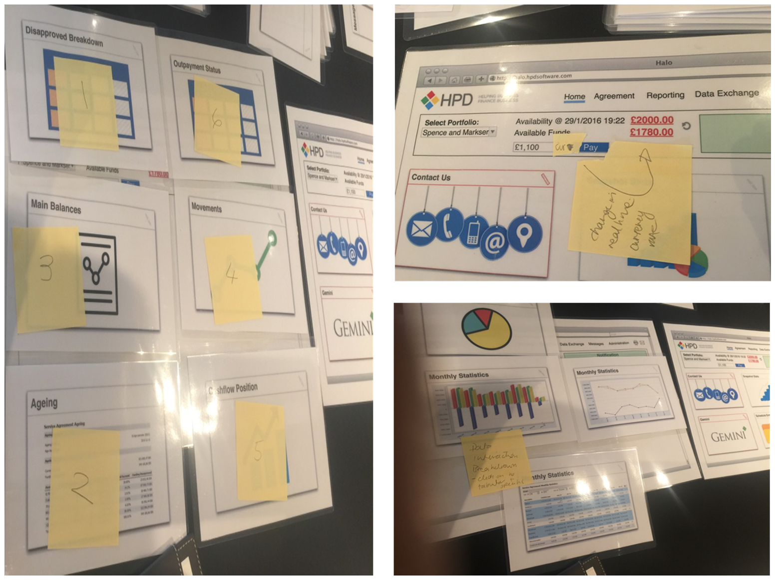
The sessions were a good (cathartic) opportunity for clients to both rant and be creative!
The pictorial probes used in the design sessions was an adapted tangible version of Samantha Warren’s Style Tiles. A large laminated mock up screen was positioned where users could place individual rectangular cards that represented key functionality available in CM. This allowed the participant to identify and voice the main pain points currently experienced and to facilitate ideation for redesign. In particular, the various user journeys for specific tasks were identified as well as changes to the information architecture.
Key findings from the research phase:
92% of participants found the Client Manager difficult to navigate:
The key issues that discussions revealed was a lack of structure and findability of information to complete tasks. Participants said:
I want to see overdue items on the home page.
I need to be able to select a day, then drill down to an item by clicking on a value.
I want to toggle between data formats.
I need to immediately be able to see who has paid and when.
A mini statement would be nice.
I want to be able to see all outstanding items.
I want to see movements on disapproved balances.
Could I get email notifications regarding payment?
I need a quick overview of an agreement.
Based on these findings, a table of interaction issues was compiled alongside the potential redesign ideas suggested by users.
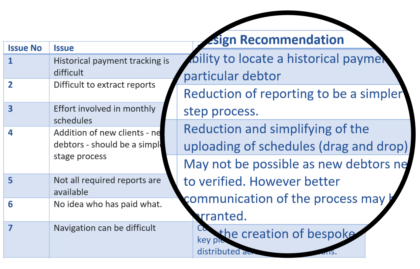
Interaction issues
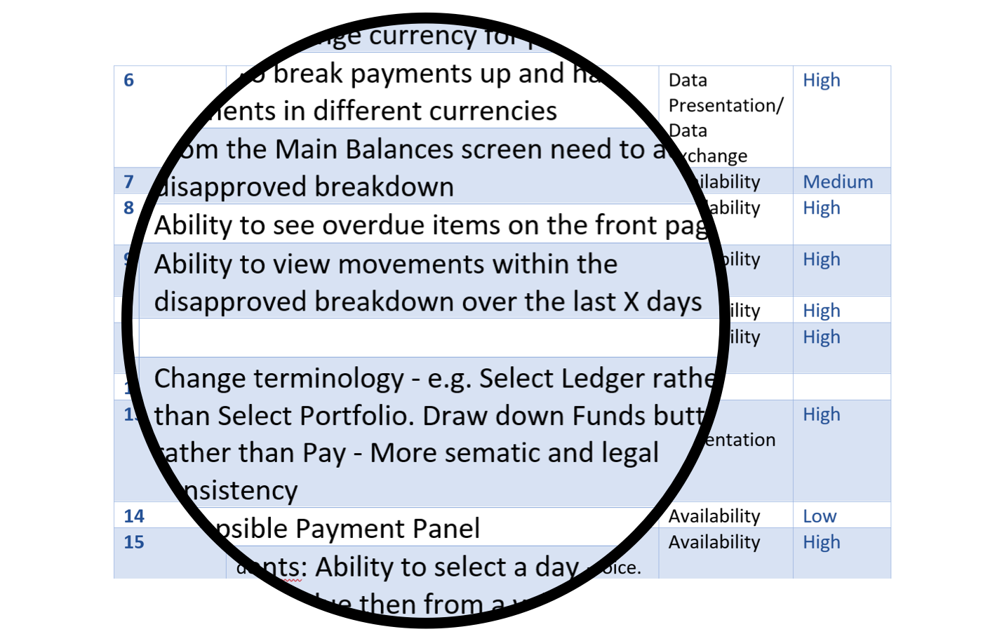
Users' redesign ideas
A Note on Methodology
The following sections of the case study illustrate how the UX artefacts informed the design. These sections do not document a linear process, as the agile approach used in the research, synthesis and redesign phases was both iterative and recursive (each phase informed the others).
Synthesis
Drawing upon the heuristic analysis and participatory design sessions a hierarchical task analysis was completed.
HTA-identified goals for the prototype included:
Personas
The personas were developed and informed using the iterative methodology within the project. The personas are a composite of data and insights from the participatory design sessions, guerrilla usability test and the focus group discussions. Each persona was used to derive specific redesign suggestions for that type of user.
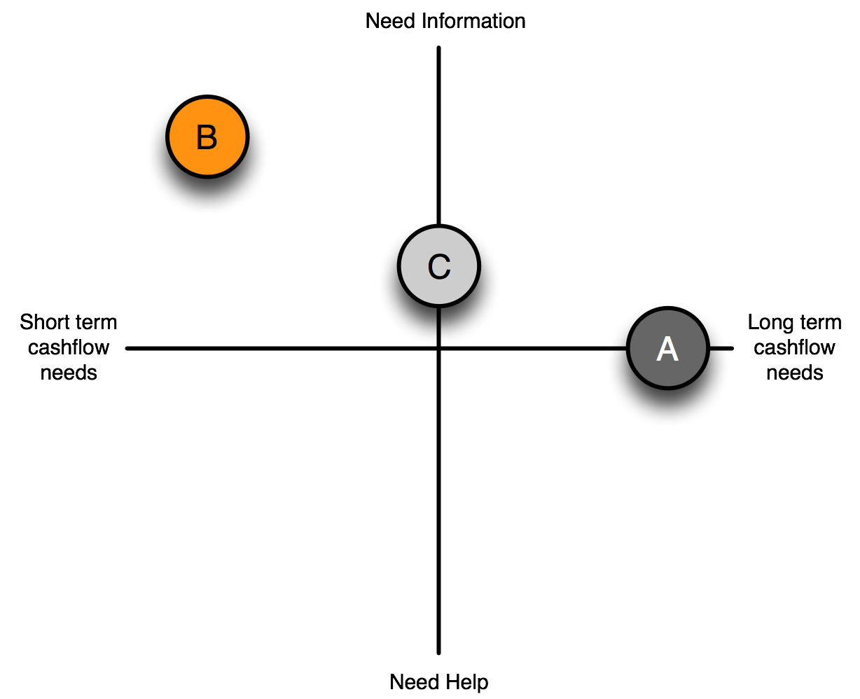
Persona Matrix
A |
Responsible Client |
B |
Smart Client |
C |
Cautious Client |
Persona B
Persona B was derived from the research phase and the usability test.
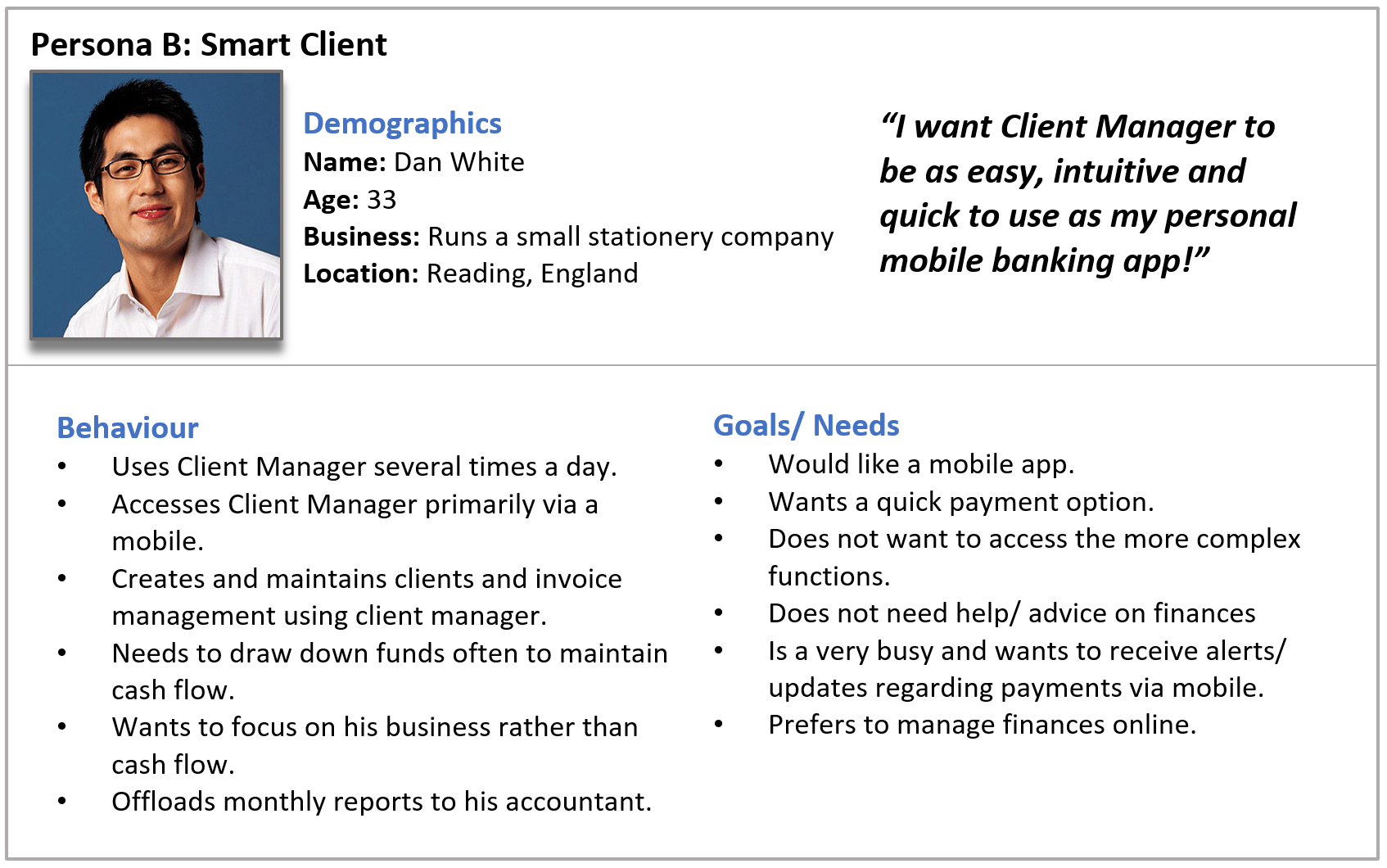
Persona B: The "Smart" Client
The key redesign suggestions for persona B type users were:
Persona C
The persona was primarily constructed from the focus group meetings in Stockholm, Sweden. Members of the focus groups were asked to identify their pain points with the current CM application, the goals they would like to accomplish with CM. The initial prototype was demonstrated to the users and they were invited to give their reponses to the prototype.
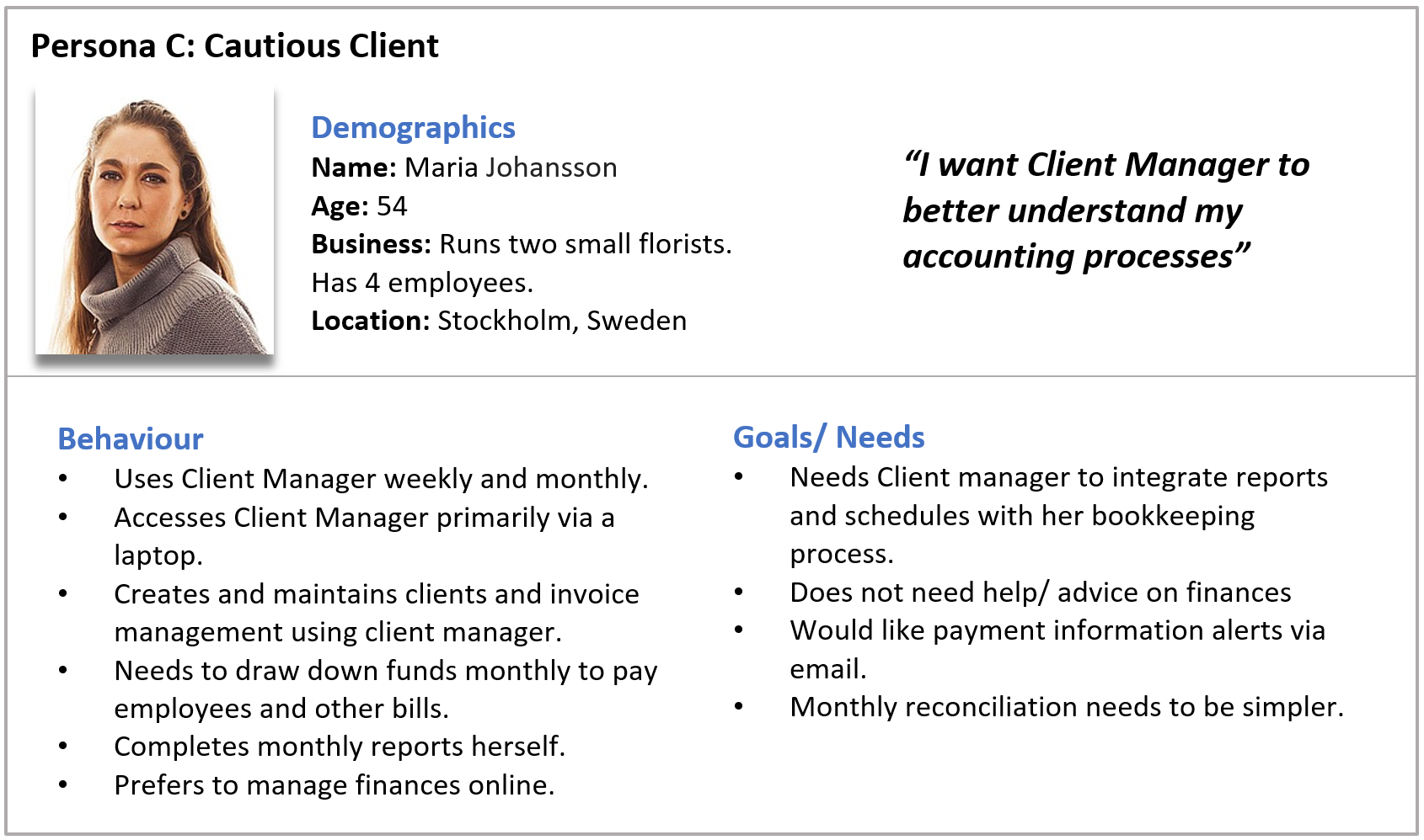
Persona C: The "Cautious" Client
The key redesign suggestions for persona C type users were:
Synthesis / Evaluation
Focus Groups
The purpose of the focus groups were:
Redesign
The redesign phase was iteratively informed by the research and synthesis phases. The wireframes were constructed keeping the personas in mind so that all of their goals and needs could be met. These wireframes would be used to help inform the web application development.
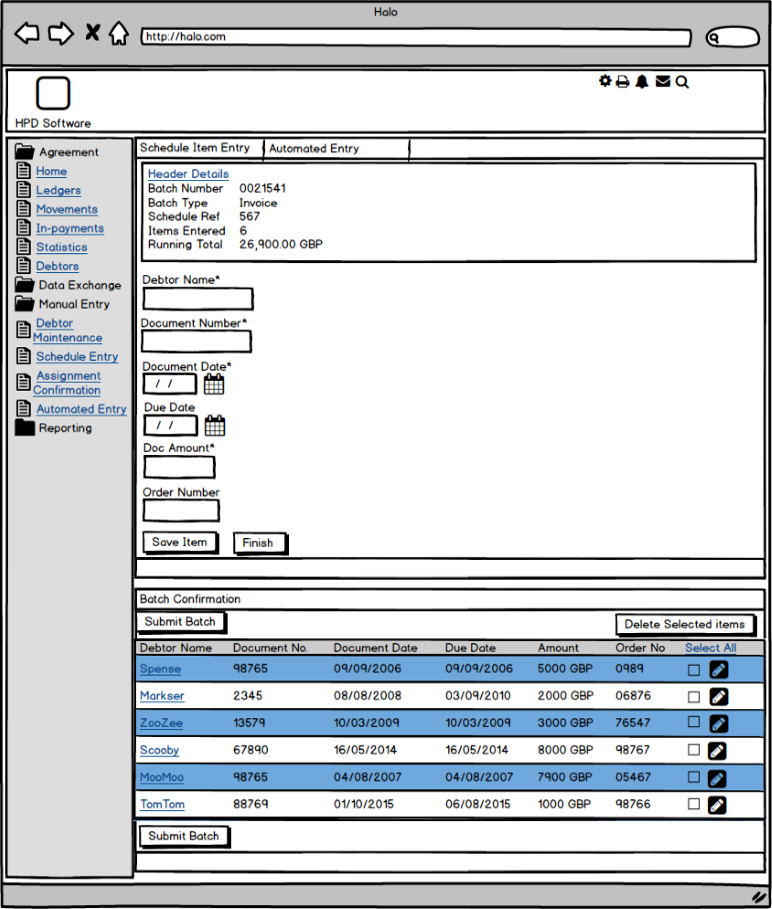
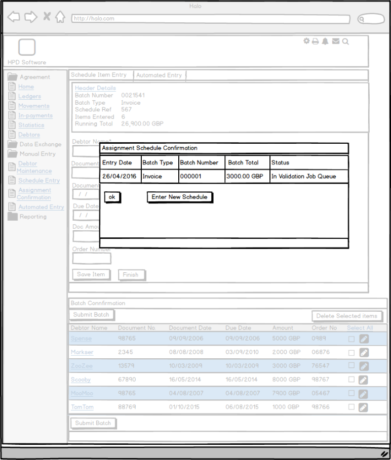
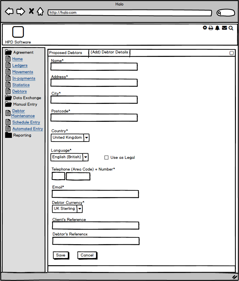
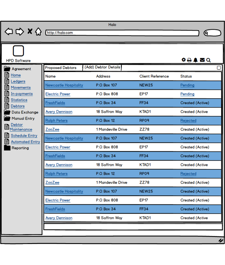
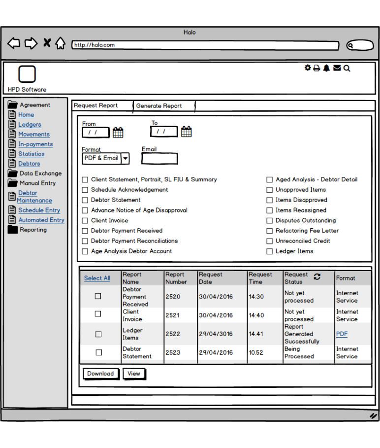
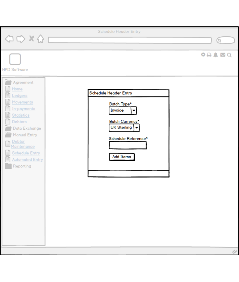
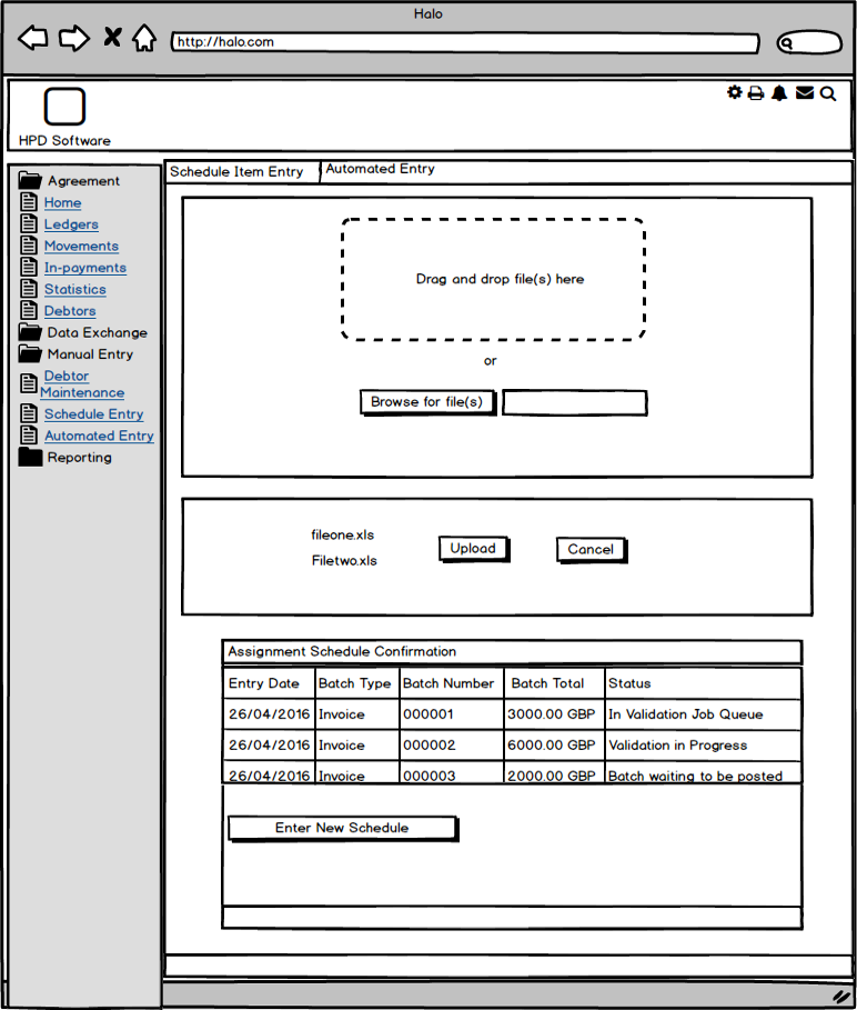
Wireframes
Evaluation/Redesign
Usability test of initial web prototype
An initial prototype which focused on a dashboard and payment was developed to guerrilla test with end users in the UK. This prototype was predominently HTML and CSS, with Javascript to add interactivity to hard-coded data. The only hub area that was designed and developed at this point was the Agreement hub. The Reporting, Data Exchange, Debtor and Admin hubs still required further research.
The purpose of this test was to gauge initial responses to the functionality and user experience of the prototype and to establish redesign suggestions in the next iteration of design and development.
At the beginning of the session, the participants were interviewed to discover his or her needs and goals from a redesigned Client Manager.
They were then invited to use the prototype to navigate through several tasks. Their responses (using the "think aloud" protocol), and rates of success were recorded.
Guerilla Usability Test
Responses to the HTML prototype were positive. The System Usability Scale (SUS) provides a “quick and dirty”, reliable tool for measuring the usability. It consists of a 10 item questionnaire with five response options for respondents; from Strongly agree to Strongly disagree. It allows you to evaluate a wide variety of products and services, including hardware, software, mobile devices, websites and applications.
The prototype achieved a usability score of 90 (out of 100)
Participants used the following words to describe their experience:
Appealing
Clear
Easy to use
Engaging
Organised
Professional
Straightforward
Efficient
Participants used the following words to describe their opinion:
Accessible
Consistent
Fast
Effective
Usable
Attractive
Business-like
Understandable
Final Prototype
The final prototype was built as a full web application using PHP as the server-side technology. A model-view-controller design pattern was used, implemented in standard PHP without using any frameworks so as to maximise code readability. Based on the UX design process entities were identified and a database designed and populated with sample data, and an associated data access layer and model classes created. This meant that future developers would have the option of modifying the data access layer to reference the live system, effectively turning the prototype into a live application.
To enhance the user experience a variety of client-side technologies were used to supplement standard Javascript and JQuery.
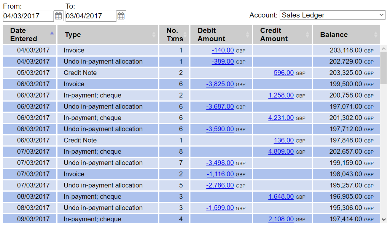
The JQuery library DataTables was used to display tabular data in a dynamic way. AJAX is used to load portions of large datasets on demand, making for an improved user experience. The library also allows users to quickly filter and order data.
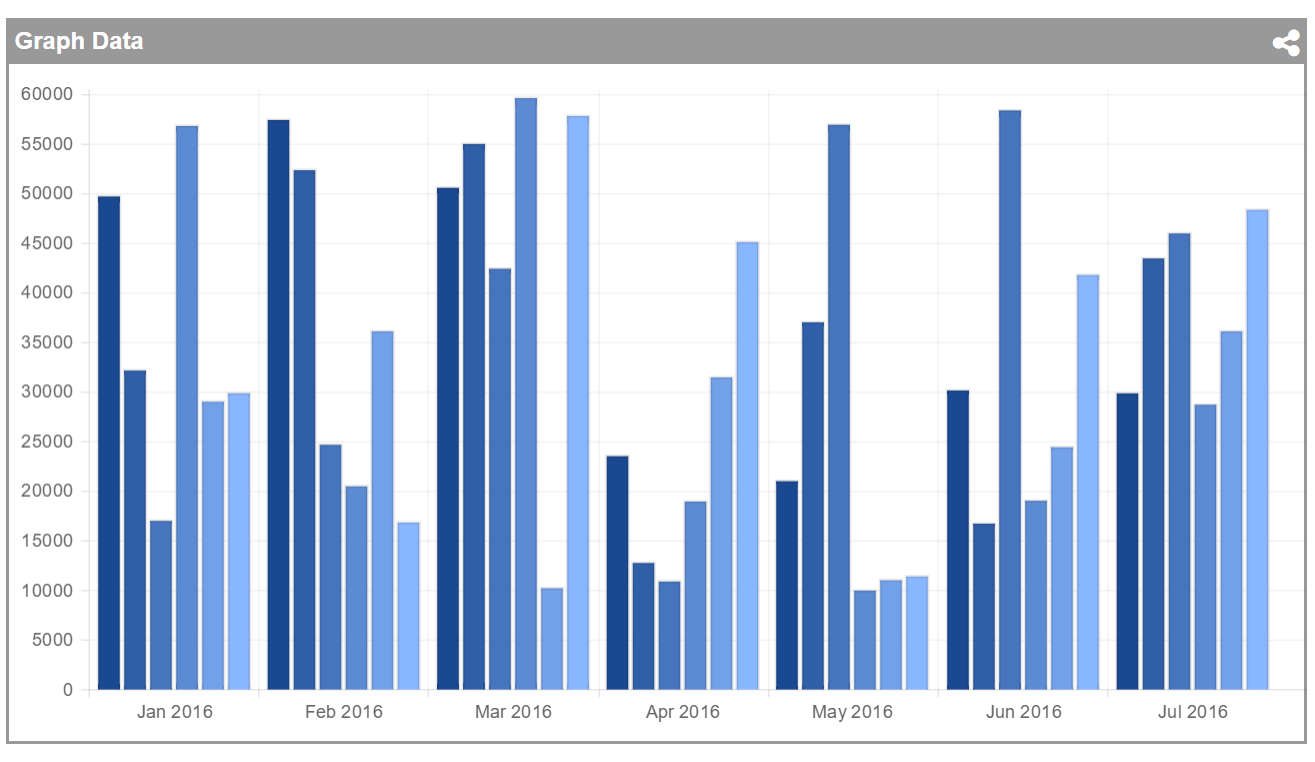
Chart.js was used to display visualisations of data. Like DataTables, the library allows the user to easily filter and manipulate the visualisations. Different presentational styles can be applied to accommodate the presentation of a host application.
A fully operational version of the prototype can be viewed here.
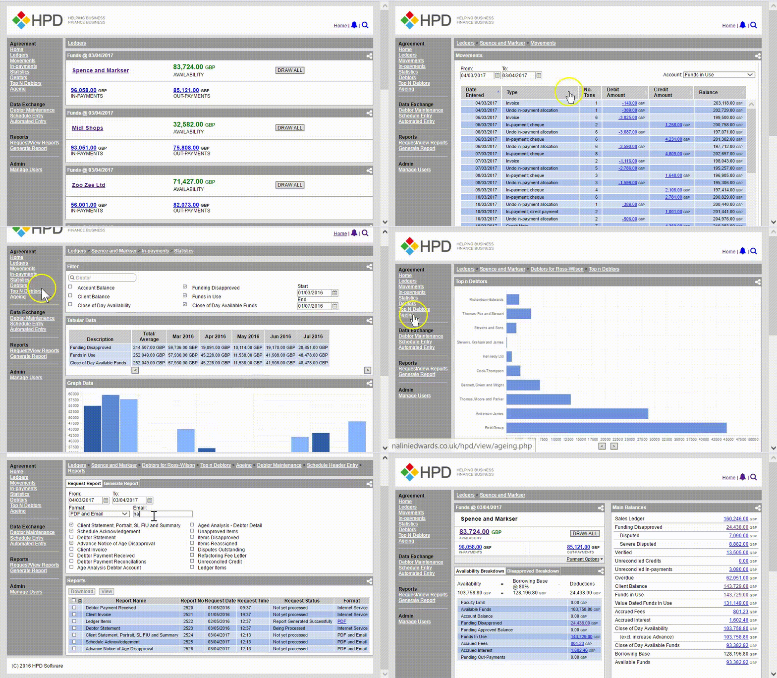
Final Prototype