About the project
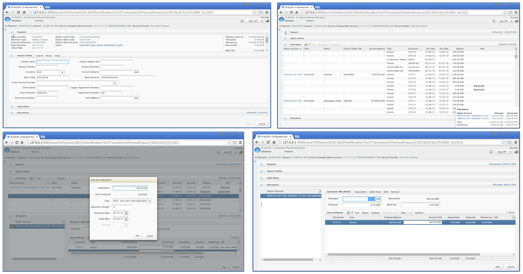
The AURA project set out to redesign HPD's primary factoring software AQUARIUS. AQUARIUS was originally written as a desktop Java application, and as a result of customer demand it was ported to a GWT-based web application. It has also had a number of ad hoc modifications. The fragmentary nature of development has resulted in a lack of consistency in its visual design and user experience. AQUARIUS retains many GUI conventions from Java Swing which are outdated in a modern web application.
My Role
My role in the AURA project was to:
The Process
My methodology; diagram illustrates the structure and flow of UX processes I used within the AURA project.
Research Phase
Literature Review
What is factoring?
As I was new to the factoring domain, I spent some time reading in-house documentation in order to understand the process of factoring and the purpose it serves for businesses in maintaining their cash flow.
The factoring process
Online forms
The vast majority of AQUARIUS is composed of data input forms, therefore I spent time reading and assimilating best practice in user experience design for online forms. Key insights from the literature review were (Jarret, 2008):
Heuristic Analysis and Cognitive Walkthrough
To identify the scope and specific areas of redesign I conducted a heuristic analysis and a cognitive walkthrough with the development team. I also interviewed the sales team to ascertain the pain points for HPD’s clients. It also was an opportunity to better understand the business and technical processes that underpinned the system.
Key issues:
Synthesis
To understand how UX best practice for forms could be supported in AQUARIUS, it was essential to understand users' goals. Discussions with the sales team enabled me to construct a persona of a typical back office user of the AQUARIUS system.
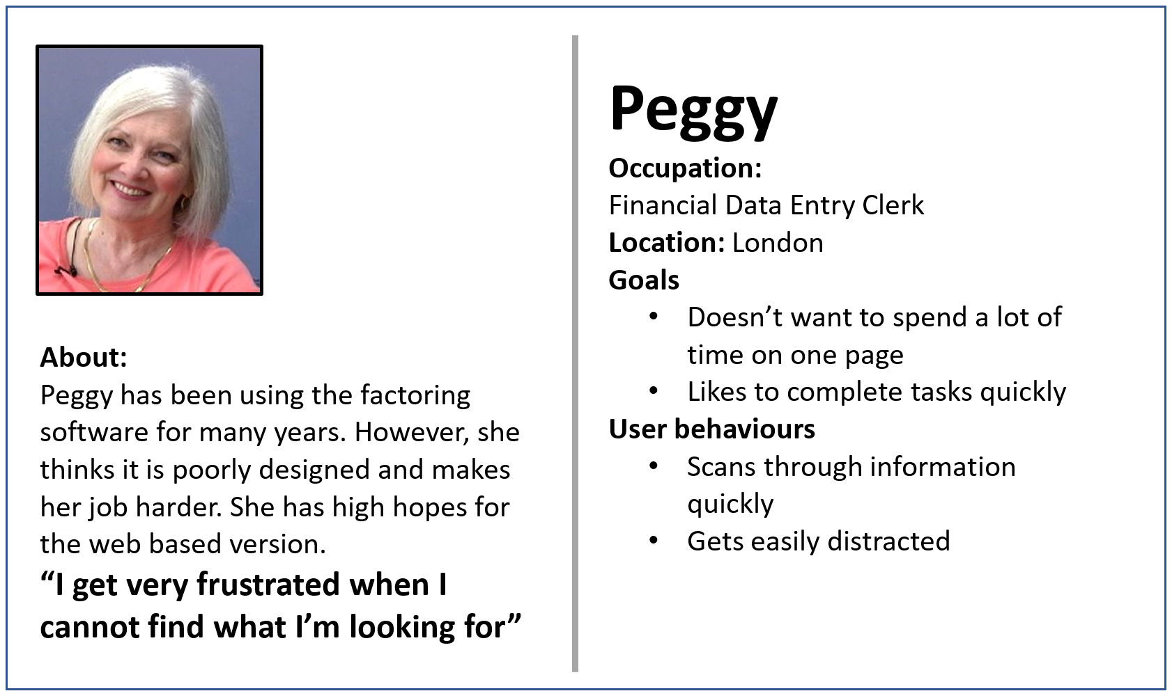
Persona for "Peggy"
In relation to the literature review on forms, Peggy does not readily identify with any of the persona types. The type she most resembles is a rusher. However, from my research, it was clear that Peggy was a seasoned data entry clerk; a user who knew the forms intuitively and had to regularly use them to input potentially large volumes of data. Thus, she does not rush because of a sense of impulsivity rather her familiarity with the nature of the information and the information that requires input has increased a level of automaticity in her actions. This persona is distinct from Jarrett's personas, and I defined this persona the scanner.
In terms of the relationship of the form: the forms needed to ask questions that were directly related to the completion of Peggy’s tasks and support her work flow through completing a process. This meant fields must be logically ordered and enabled to receive the correct type of input that Peggy wanted to insert.
The conversation of the form design suggested that that the interaction (especially feedback from the system) in response to her entries should support the workflow. In AQUARIUS this meant that key information should not be distributed across different screens forcing Peggy to navigate away from her primary task. Another key user need was the ability to use the keyboard and the tab key to input data.
The appearance of form fields also needed to be clear and intuitive. AQUARIUS had many screens with a number of redundant, disabled and duplicated fields/buttons that confused users.
Redesign
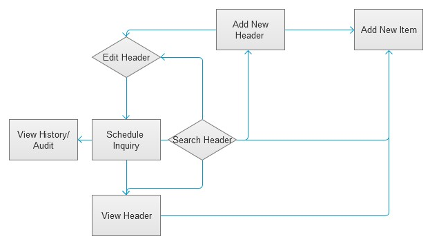
Visual mapping of processes
To understand many of the complex processes involved in activities such as allocations or entering in-payments, I mapped key workflows which helped me to identify the points where UX best practices could help minimise some of the issues faced by users.
Paper prototyping
Prior to wireframing, I sketched my redesigns on paper. I used paper prototyping techniques as they could quickly make the designs accessible to the development team. The team could then evaluate and collaborate by adding to the sketches. Working with paper allowed a broader and more rapid iteration of ideas.
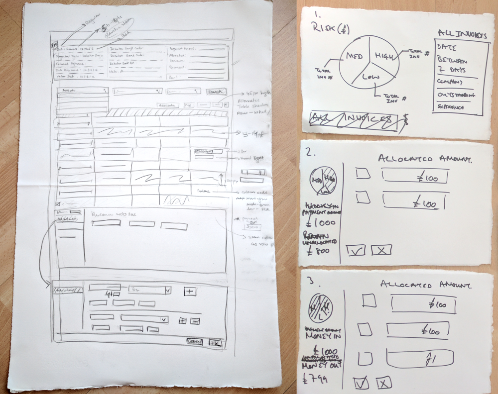
Wireframes
Once I had a cohesive design of a specific process on paper I then created wireframes which could be passed to the development team some of whom were in-house and others who were outsourced in India.
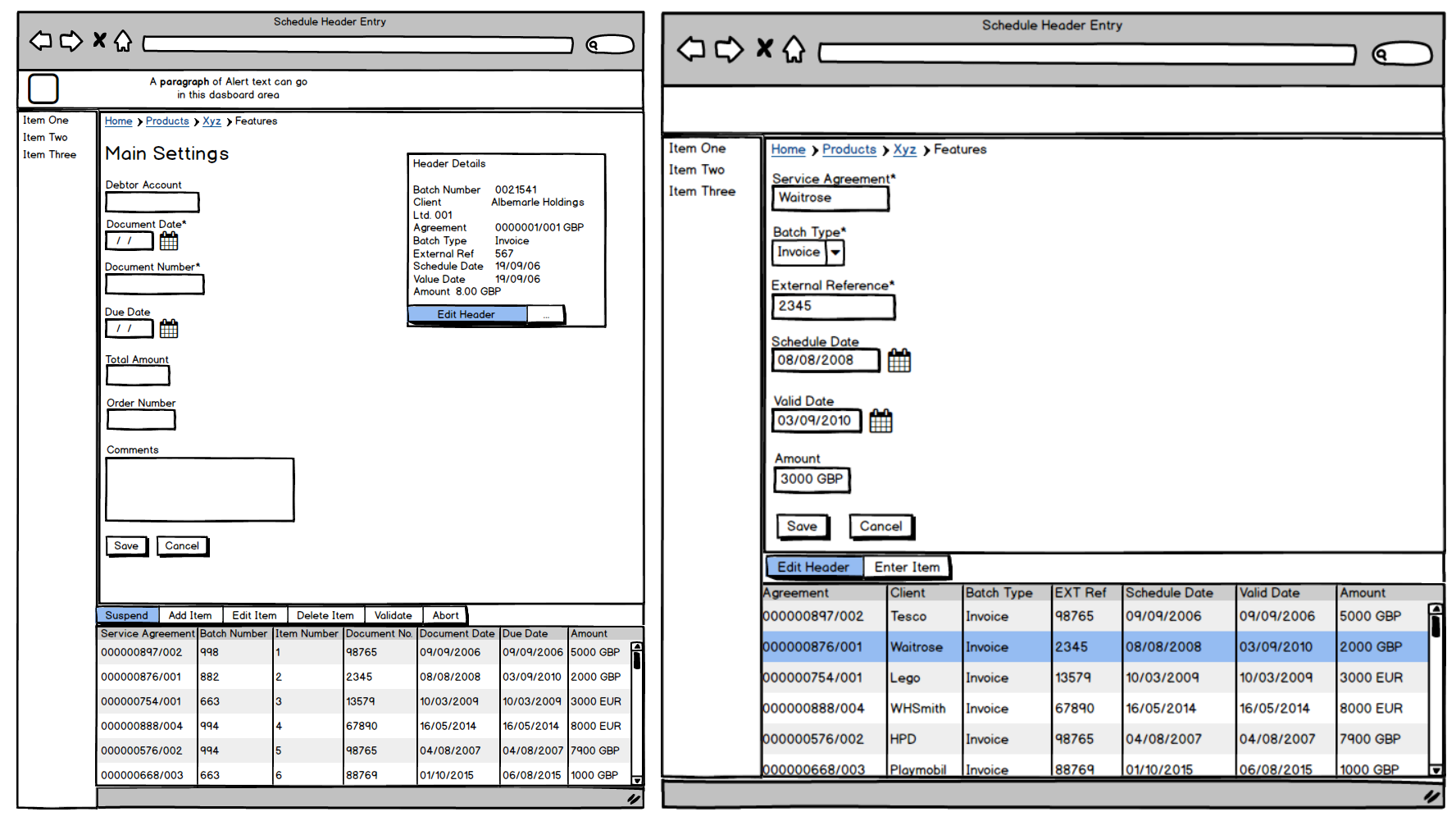
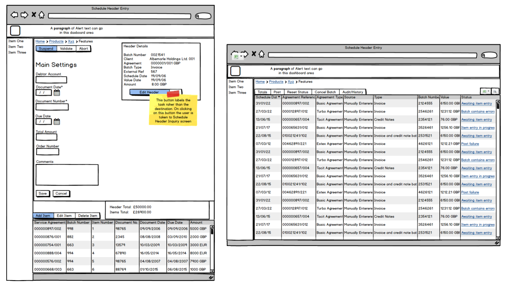
Wireframes
Design Guidelines
I was asked to compile a design guidelines document that would include UX best practices to inform future development. The guidelines were derived from both HCI theory and the research phases of this project.
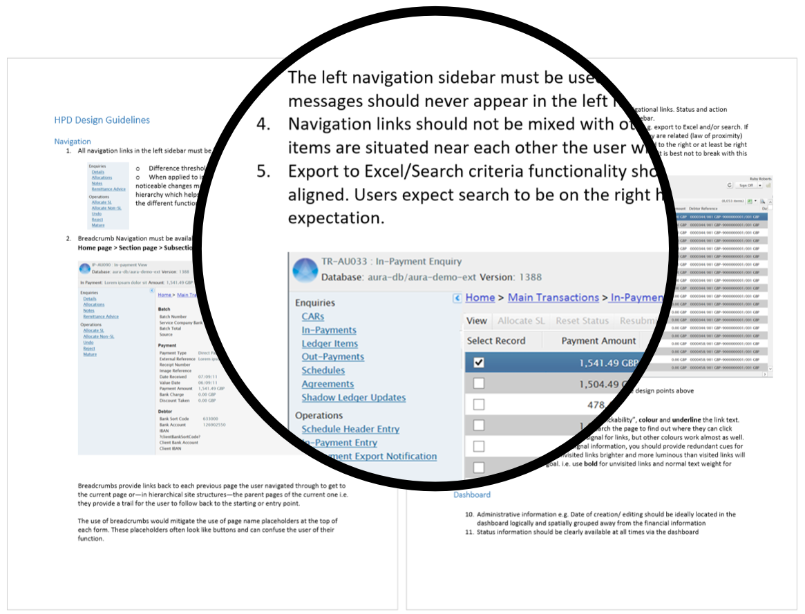
The AURA design guide